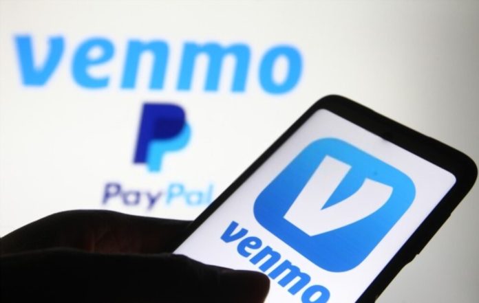
The Venmo logo is an excellent example of a professionally designed visual identity because it has all the hallmarks of an iconic symbol. We mean by easy to understand, engaging, adaptable, and memorable. These features have contributed to its practical significance and prominence.
There are two components to the Venmo logo: the wordmark and the icon. The designer executed the logotype in lowercase letters to emphasize its image. The selected typeface is an eye-catching sans-serif that features an unusual V. Ingeniously, a square with rounded corners serves as a home for the same letter.
In addition, the logo’s graphic element was formed by the balance between the letter and the square. Shine with a baby blue and white color scheme; they are gorgeous. Looking at them, you can feel their undying devotion, security, and serenity. Interestingly, it has been giving off these feelings since its release in 2009.
PayPal, a global leader in the online payment industry, owns Venmo. As a result, the PayPal logo is quite similar to the Venmo logo. They paid Braintree $800 million to acquire the then-four-year-old company. Braintree purchased the company’s brand from its creators a year earlier in a welcome turn of events for $26.2 million.
The Story Behind Today’s Venmo
Initiated as a means of accepting payments for a good friend’s yoghurt business, Venmo has since expanded to other uses. Andrew Kortina, one of the company’s co-founders, made this discovery. He partnered up with Iqram Magdon-Ismail, who he met during his time at Penn.
About $159 billion was transferred through the Venmo platform in 2020. You can gauge its popularity based on this sample size. More specifically, it’s a system allowing mobile transfers between users. In addition, it ensures a safe, quick, and trustworthy method of cash payment.
Finally, Venmo is an acronym for “vend + mobile.” The Latin word for “sell” is “vendere.” There’s no doubt that this denotes a shift toward mobile commerce. The name has the added benefits of being memorable, simple to spell, and brief. The final decision was based on these considerations.
Venmo Logo Evolution And Its History
A savvy business owner will not mess with a successful logo. Indeed, the Venmo icon can be classified as such. The company’s mascot hasn’t been modernized in over ten years. As a result, it has controlled its amiable light-blue and white demeanour. Because of this, it has become an iconic symbol.

Let’s get right to it and find out more.
2009—Present:
Those who use Venmo will immediately be drawn to the logo’s modern aesthetic. There’s a picture part and a writing part. In the graphic element, a V is enclosed in a rounded square. Design-wise, the single letter features a straight bar on the left and a curved one on the right. It can now stand tall in its unique way, filled with pride. The logotype is then presented in all lowercase letters below the stylized emblem. The electric blue and white colour scheme of the Venmo logo is very eye-catching.
Precisely what is the secret behind the success of the Venmo logo?
Attractive Logo:
If you had to choose between two boring and one beautiful logo, which would you work on? Selecting this option is simple. It’s safe to assume you wouldn’t bother with the uninteresting logo. That’s why the Venmo logo is so successful. Because of how visually arresting it is, users’ attention has been drawn to it. So it has gained reliability and the favour of its clientele, who remain loyal.
The Brand Is One of a Kind:
Remarkable things tend to be the most noticeable. And the same holds in business. Because of this, your logo needs to be exceptional if you want your brand to stand out in a crowded market. Fortunately, this fundamental fact is reflected in the Venmo logo. As a result, it has a distinct visual identity that stands out from the crowd.
There’s Nothing Complicated About The Logo:
The Venmo logo appears friendly and approachable. It uses fewer elements to convey its message. The visual components also correspond to the provided services. Therefore, the logo is simple and easy to recognize, comprehend, and recall. Keep in mind at all times that intricate logos are ineffective.
When clients readily recall your brand, you know you’ve created a memorable logo. Aim for simplicity and originality to create a logo that stands out from the crowd. The Venmo logo, fortunately, shares these traits and makes a strong impression. Keep in mind that you want your brand to stick with people.
In other words, the logo can grow with your business.
Both the scale and the medium you’re working in will have an impact on how effective your design is. Therefore, pursuing a logo design as simple as possible is prudent. It’s important to note that the Venmo logo is adaptable to be used in various marketing contexts. The key is to be present where your target audience already is.
Final Thought
Venmo’s branding is unique. As we enter a new technological age, any logo used to offer a service to other businesses must establish rules to protect the original copyright. We couldn’t find the Venmo logo’s origins. Who created the current version hasn’t been emphasized. Internet logos vary because the company has granted customers some freedom to use Venmo as a payment option. Who designed the first Venmo logo and the current one? We assume Venmo’s founders created the logo. It seems reasonable without more evidence. Venmo’s parent company probably designed the latest version. The good news is Venmo’s logo can be customized to suit users’ preferences within the app’s guidelines.


