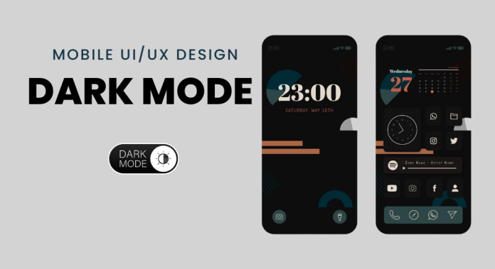
The millennials are obsessed with dark mode across mobile and web apps, and for all the right reasons. It is easy on your eyes and saves the battery, no wonder an easy choice. All the popular apps are working on making their dark mode designs as pleasing as the normal modes. Let’s find out how you can design an appealing dark mode to enhance UI UX Mobile App Design.
Dark mode is a fairly new addition to the world of mobile and web apps. These dark themed user interfaces were under the spotlight after it was introduced in Android 10 and iOS 13, and there has been no looking back since. If you want to retain more users, offering them an unprecedented user experience is vital – dark mode in mobile apps helps you do just that.
Do you want to understand the nuances of designing dark mode for improved UI and UX? Let us get you started.
Designing Dark Theme for Android
According to reputed design experts and researchers, the designing of a dark themed user interface revolves around four principles.
Grey, not Black
If you pay attention to the dark theme in an app, you might realize that the default background is just a darker shade of the color grey, and not black. The primary reason why most designers prefer using a grey instead of a black is placing various elements against a black background result in a very high contrast, and thus causes strain on the user’s eyes.
Color Accents
Using limited color accents allows the designers to dedicate maximum space in the user interface to the darker surfaces. A designer may also use split supplementary colors to add the required contrast without having to worry about defining a complementary color scheme.
Battery Life
Reducing the use of light pixels in a dark themed user interface is an effective way of conserving battery life. This also helps reduce eye strain, and facilitates screen use in a dark environment. If you have a device with an OLED screen, you will also be in control of turning off black pixels whenever needed.
Accessibility
There are a lot of users who are more comfortable using dark themed user interfaces, and they enjoy accessibility color contrast standards.
The accessibility of a dark themed user interface is defined on the basis of the following properties.
Contrast – It is vital that the background is dark enough to showcase white body text. The minimum contrast level between the background and the text must be 15.8:1.
Depth – The components used while designing a dark theme often retain default shadow components and elevation levels as were used in the light theme. In this case, the designers use lighter surface colors to express depth.
Desaturation – In order for the primary colors to pass the Web Content Accessibility Guidelines’ AA standard, they might need to be desaturated.
Opacity Levels – Whenever a light text is placed on a dark background, it must meet certain opacity levels:
- High-emphasis text – 87%
- Medium-emphasis text and hint text – 60%
- Disabled text – 38%
Designing Dark Theme for iOS
With their dark theme designs on iOS 12, Apple has redefined the meaning of UI styling and colors in iOS. Some of the highlights have been discussed in this article.
Semantic and System Colors
Apple balances the look and feel of iOS apps using semantic colors, that is, colors with the best RGB value. The semantic hues also help dealing with overlay colors and text in the dark mode. The company has also introduced nine predefined system colors that support system-wide appearance and dynamic in the dark mode.
Vibrancy and Blur Effects
With the unveiling of iOS 13, Apple also introduced 4 blur effects and 4 vibrancy effects. Each of these adapts to the interface style, whether light or dark.
SF Symbols
Apparently, the tech giant provides its product developers and designers with a collection of over 1500 symbols for them to use in their applications. Since these symbols are optimized for both light and dark user interfaces, they go along well with the dark mode too.
5 General Tips for Designing Mobile App UI & UX for the Dark Mode
The demand for dark mode in mobile apps has increased significantly over the last few years because of the numerous benefits it offers to the users. Offering dark mode has become an essential part of creating an appealing user interface for your audience.
If you are still new to designing apps for the dark mode, here are certain tips that might help.
- Give dark grey a higher preference over pure black.
Using dark grey over pure black for backgrounds lowers strain on the user’s eyes and creates a pleasant user experience for them.
- Avoid using saturated colors.
Highly saturated colors are very difficult to read against a dark background. A lighter tone would offer a much better readability.
- Test your design for both the modes.
Sure, designing for dark mode is key but the light mode too deserves proper attention and maintenance. Testing your user interface design for both the modes should be a must.
- Choose colors consciously.
A number of designers end up making the mistake of simply flipping the colors when transitioning from light mode to the dark one. This trick seldom works well. You should be more cautious and conscious with the colors you choose for your user interface design.
- Optimize animations and illustrations for dark mode.
In addition to the text, animations, illustrations, and other graphical elements should also be optimized to look good on a dark theme.
Final Thoughts
Dark mode has become an instant favorite for most young users, and the revolution has just begun. It’s time to unlearn your signature designing style to make room for this new wave in mobile app UI & UX design.


